Having an online travel booking business can be quite the technological challenge. In truth, the market has been pretty much assimilated by a few mammoth companies like Momondo, Kiwi, Skyscanner, Google Flights, Hipmunk and Kayak.

THIS IS THE STORY ABOUT ONE OF THEM: SKYSCANNER. SKYSCANNER IS A LEADING GLOBAL TRAVEL SEARCH COMPANY. ITS REVENUE IS ANYWHERE FROM 100M — 500M PER YEAR. FOUNDED IN 2003, IT’S AVAILABLE IN OVER 30 LANGUAGES AND HELPS OVER 60 MILLION PEOPLE EACH MONTH TO FIND THEIR TRAVEL OPTIONS. THEIR AWARD-WINNING APP HAS BEEN DOWNLOADED OVER 60 MILLION TIMES. WOW!
We will cover their client success stories as this is what my contribution to their business has been and it’s what I like to do and talk about. My blog, my topics, haha!
The company started off by developing a super cool search engine that scraped and indexed data from many different flight agencies , and it kept growing it to where it is now over 300.
Their main support issue was that users were booking flights through their website and having different inquiries: Where is my booking confirmation? When is my invoice coming in? Can I change my booking? And the list went on. Skyscanner’s issue was that they are not a booking agency, rather a very slick search engine that just topped the ticket price sold by agencies with a small fee. Genius!
We used their help desk or support desk — however you want to call it — to handle this by placing an alert popup which stated a simple message “WE ARE NOT A BOOKING AGENCY”. This would take the user to an article page where they could read about the matter and search for their respected booking agency to sort their issue directly. Pretty smart, right?

Ok, I’ve not mentioned that they have a help desk filled with amazingly well documented article knowledge base. As I’ve mentioned in a previous read, having a well documented knowledge base is key to great support. Their articles are real use cases from real people. Know your users and what they need from you.
A few other smart things we’ve done that reduced incoming tickets or ticket deflection is:
- Direct users to the most searched for issues on the support site. If enough people searched for a specific issue/keyword, that issue would be dynamically populated in the main page of the help center. This way, users would be able to self help themselves to solve their inquiry. In any case, it’s worth mentioning that the support issues are mostly the same(95% of them) once you’ve grown your user base to a certain extent.
- Following the same pattern, with the help of Google Analytics, we made the 6 most clicked through articles in the help desk to get dynamically populated in the homepage. Again, most users having the same type of inquiries, it only makes sense to encourage them to see what others are having problems with and get cracking with that self help, which in my view, is KING(or QUEEN).
- A small sneaky design tweak that made quite a bit of an impact on reducing incoming ticket submission was the fact that we hid the “Contact Us” Call To Action in the articles. Users were encouraged to first browse through the content, open an article and only then be allowed to send in a request. This was the cause for a 20% reducing of incoming tickets. This is due to having a great knowledge base that would eventually solve user issues through self help. Users don’t want to spend time reading, who has that kind of time? They want to immediately talk to someone as I’ve mentioned here. That’s where we came in, and kind of made users think “What the heck?”, but in the end, it got them to what they were looking for — if the business you’re engaging with cares enough to give you the well documented self help needed.
To emphasise a bit more on user feedback, we created a sleek satisfaction survey that mimics Airbnb’s. Again, listening to users problems is only to your business’s benefit. The basic idea is that users are able to send feedback directly in the knowledge base articles, which the help desk does not offer in their out-of-the-box Help Center. With a little customization though, we were able to implement this survey saving time and improving the experience for everyone. The basis here being that you grow and evolve based on constantly improving your support and, in the end, your customer success.

Reducing agent time and saving money.
In Skyscanner’s case, we did this by a targeted ticket submission process. If a user were to send in a request regarding whichever inquiry, we would know on which article they were, which section and which category. That ticket would either be directed to the appropriate team who was dealing with that specific issue, or it would get an automatic response with the issue resolution. Setting up business rules is key only after you understand your business to the fullest. In my view, caring for your user’s success stories has never been a better solution to a successful business. In other words, care for them and treat them like family and they will come back every time.
As the flight booking business was doing great, Skyscanner added a Car Hire and Hotel Booking features. If you have a ton of traffic to your website, why not combine related businesses, right? Well, they’ve done just that and that’s also making up to a good chunk of the company revenue now. It was doing so well that it caught the eye of a wealthy Chinese investor that bought it for £1.4Bn. Not bad, eh?
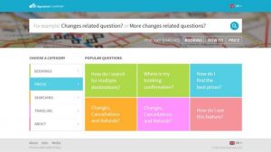
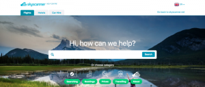
In terms of help desk design, we’ve made a super stylish user tested interface that makes navigating through the help center super easy and fun. We’ve color coded the different categories so that the user always knows where they are. The user experience here makes me quite proud of the work we’ve done. See it in action here. Of course, being a leading global company in the field requires constant innovation so the design and feature updates has been in constant motion.

Conclusion
We’ve talked about how the success stories in Skyscanner’s back yard made it the company it is today. We talked about ticket deflection techniques, we’ve gone over user feedback, the smartness and impact of good self help, sleek designs, constant innovation, having a great knowledge base and catering to your users needs. It might sound complicated and that’s because it is, but with a bit of open mindness and good people, anything’s possible.
Wanna chat with me? I don’t bite, darlings, so say hi@dominiccx.com and follow me for more CX goodies.
Until next time ??

